A couple of weeks back, we wrote about Pinterest and how to decide if it’s right for your business. One of the issues we mentioned was that Pinterest is a very visual medium, and if your business doesn’t naturally lend itself to visuals, it needs a little more creative thought if you want to get a piece of the action.
In the course of exploring this idea for a client, we thought we’d have a little fun with it for our own brand. Our social media services aren’t a natural source of eye-catching material; most of what we do is verbal and text-heavy.
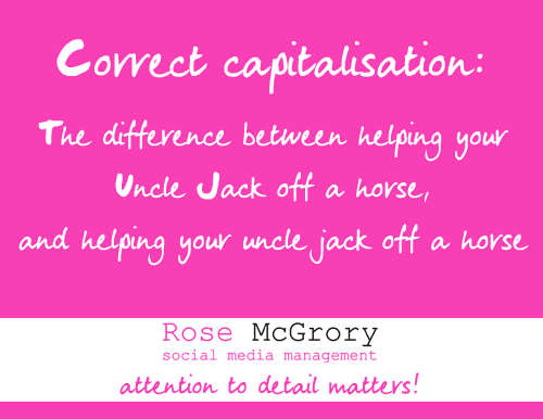
Hence our 30-minute lunchtime challenge: to create something that was shareable on Pinterest, but still relevant to our company values and the messages we want to get across.
Here’s the result…
Why that?
We know people love to share things that make them smile. We also realised, from an analysis of what was coming up as popular on our Pinterest home feed, that you don’t absolutely have to exclude words – in fact a good proportion of the popular stuff is pithy, often slightly edgy, quotations.
Finally, one of the messages we want to get across to prospective customers is that we pride ourselves on quality and attention to detail, so this quote works perfectly to support that.
Did it work?
We saw an immediate impact from this approach, yes. The image was shared more than anything else we’d previously posted, we picked up some new followers, and most importantly we saw Pinterest.com show up in the referral stats (Google Analytics) for our website for the first time ever. So, people were curious enough about what we do to come over to the website and find out more.
Applying it to your business
A few thoughts about what we learned from the experiment:
You don’t *have* to have stunning visuals to make an impact. We probably could have increased the impact more with some illustration – if we’d had a bit longer, something along the lines of one of those retro cowboy drawings, and a quick google for “surprised horse” might have been fun. But you CAN do without it – if you don’t have graphic design skills or budget to buy them in, you can manage without.
Be appropriate for the site. There are a small (and hopefully dwindling) number of people out there who might consider this wildly inappropriate for a business communication, or even be offended by it. Would we have posted it on LinkedIn? Probably not. But it’s in keeping with the tone of humour on Pinterest; frankly a large number of users there would very likely be “offended” by standard marketing. If that doesn’t sit comfortably with your brand then it’s best to skip this kind of site altogether.
Think a bit out of the box…. or whatever non-Apprentice speak you prefer for “trying a different approach”!
Don’t lose sight of your brand. It’s tempting to chase the crowd here by just posting up anything you think might be popular – and to an extent, that approach may work. A few eyeballs might end up on your site as a byproduct of idle curiousity. But it’s so much more powerful if you can keep a link to your marketing messages AND create some popular content.
If you’re on Pinterest, come and find us here. If you’re not and would like to be, leave a comment asking for an invite and we’ll send you one (we’ll get your email address to send the invite to, but it won’t be published or used for any other purpose!)


Leave A Comment