Your social media presence is an integral part of how your company presents itself online. So, if you have anything more than the most passing of relationships with a client or prospect on social media, the chances are they’ll have checked out your website – and vice versa.
So, if a potential client comes to your website, where would they find your social media details, and what impression would they get from what you provide?
Quick, get us some icons…
The most common scenario we see with clients is that they either haven’t put their social media “addresses” (Twitter username, Facebook page, LinkedIn group, etc) on the website at all, or they’re quick to say they have…but on inspection it turns out that this is just in the form of each site’s linked logo, in their footer. Often, both of these approaches have been driven, one way or another, by their website Content Management System or Web designer / agency. The details haven’t made it on there yet because their CMS is too tricky to use, they’re anticipating a redesign, or they don’t update the site regularly so it doesn’t reflect what they’re doing. In the “icons in the footer” situation, they’ve often been put there as a standard “value add” during a previous redesign, often regardless of whether the client was intending to use the linked sites at all, or had a strategy to do so.
Earlier this week I was told by one enquirer, “Well my web designer has put a Google Plus icon on my website, so I’ll need to do that then“. As an evaluation of which sites should be included in a social media presence, that one is right up there with the worst.
Effective social media integration
So, what’s the best practice approach? First of all, make sure your details are at least available somewhere; don’t expect your visitor to rifle through Facebook on the off chance you’re active there.
Secondly, there’s nothing wrong with putting icons in your header or footer; in fact, it’s become such a standard part of visual web “language” that the footer is often the first place visitors will look, so it’d be self defeating not to.
BUT. Give a few moments’ thought to why you’re actually on Twitter or LinkedIn or wherever, and it should become obvious where those details should really be. Social media is part of your communications strategy, right? So you’re conversing with your peers, clients or potential clients. Best place to tell them where they can chat to you? On the Contacts page.
But don’t stop there
If you have a thoughtful strategy behind your presence on each social media platform you use, you’ll very likely be doing different things with each one. So, a company creating artisan jams and preserves might use Facebook to spread (no pun intended, but as it’s there, we might as well enjoy it) the word amongst consumers. On LinkedIn, they might focus on investor information and networking with industry peers.
So when you set up that Contacts page, make sure you do your website visitor a favour, and signpost them towards whichever site will be most relevant to them. If a consumer hits your LinkedIn group and finds lots of discussion about sustainable preserving chemicals, or whatever, they’ve wasted their time – and might close their browser window without bothering to check out your lively and engaging Facebook community. It doesn’t have to be War and Peace, but a short statement explaining what you do on each site, and how it would benefit them to join in, goes a long way in providing a good user experience.
Widgets, Plugins and Live Feeds
If you’re active on Facebook, it’s a great idea to use the free Social Plugins that Facebook provides – you can find them in “Use Social Plugins” under the Resources section of your main Admin menu.
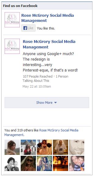
For example, the “Like box” code generates a “Like” button which logged-in users can click to Like your Facebook page without leaving your website; an optional feed of your latest posts; and an optional “face” display of others who like the page, highlighting the user’s own friends if any of them got there first. It looks like this:
 Twitter also provides a similar function, including a real-time updating feed of your latest Tweets. This can be great if the tone of your Tweets normally follows the tone your website is generally written in. Ie, your website is reasonably informal and chatty, and so is your Twitter feed.
If that isn’t the case, or you’re given to having a little banter with others in your industry via your Twitter account, think carefully before implementing a feed to the website. Taken out of context, your website visitors might find your Tweets inappropriate and / or confusing.
If you’ve integrated your social media to your website in a really strategic way, or have come across examples of sites which have, please do share in the Comments!


Leave A Comment